Ana Mackay-Sim, Global Creative Director
Thanks to everyone who submitted an entry in the Nielsen Data Visualization Contest, as well as those who shared, posted, advocated, and voted. Working at Nielsen puts me at intersection of data and design every day. In my view there has never been a more exciting place to be. There’s a kind of magic that happens when you liberate numbers from the confines of a spreadsheet and find a hidden nugget of insight. The reason for this actually isn’t that magical – it just has to do with the way the brain processes information.
For too long, data analysis has been the dominion of the left brain. The left brain is really good at Excel. It rules rational, logical thought. It loves big data, which is a good thing, because when you’re collecting, sifting, and processing data, you need to do it in the most rational, logical way to ensure you’re getting the highest quality output. But when it comes to dealing with that big data — combining it, deriving insight and ultimately making an impact, the left brain cedes control to the right side – the creative, emotional side. The right brain loves pictures. It loves daydreaming. While the left brain loves managing data, the right brain loves uncovering opportunities.
So what happens when you take these left-brain outputs and turn them into right-brain food? The whole brain is engaged in a high-order dance. We don’t just get the point, we actually care about it. And we see opportunities for those insights to make an impact in our increasingly complex world. This is the power of data visualization and the reason it’s so hot right now
Great visualizations aren’t just pretty pictures; they use visuals to help combine, contextualize, and derive insight from the data. They rely on visual cues that we have evolved to understand implicitly, to help the right brain see what the left brain can’t. Most importantly, they use design to communicate – to help lead the audience through a narrative, or invite them to create their own.
As these contest finalists show, great visualization remembers that form follows function.
Megan Hillman
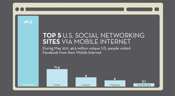
Megan has taken the traditional graphic formats, and made them easier to understand by putting them in context, and easier to read through.
Gavin Jensen
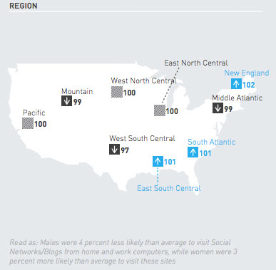
How a composition index number relates to average is hard to envision, but Gavin’s entry used color and shape (arrows) to make them easier to understand.
Ashish Naidu

Ashish used doughnut charts can compare across media types within context. Since this doesn’t add up to 100%, using a pie chart as a percent of the entire population helps keep each in context.
June YeEun Sung and Oddie Goplan
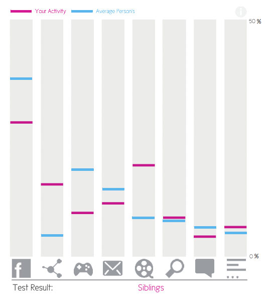
In this interactive entry you can see very quickly how your usage compares to other, which makes it more relevant to understand the world around you.
George Zhang
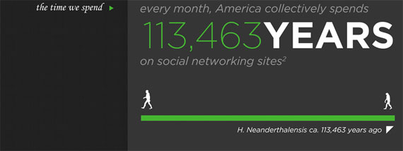
George used a very journalistic approach, going from general to specific insights. This entry puts numbers in a human context we can understand.
So what’s next? To me, the results of this contest prove a couple of things. Firstly, there’s huge enthusiasm around the idea of visualizing data, and it’s a worthwhile conversation for Nielsen to facilitate. Secondly, there are two really strong camps in the data visualization world: infographics, which use visuals to lead you through a narrative, and complex data visualization, which presents the data in an entirely new way, either making a conclusion blindingly obvious or allowing you to explore and draw your own conclusion. I’m really intrigued to see what will happen in this space and share more.
Public voting in the DataViz contest remains open through monday May 21, 2012 at 5pm ET, so please visit the contest page and vote for your favorites today!
